Do you work in an office space? Do you ever find it difficult to concentrate or get things done? This can be because of your office’s poor acoustics.
Office acoustics can have a significant impact on the workflow of your team. A noisy space can be distracting and stressful, whilst a quiet space can be efficient and productive.
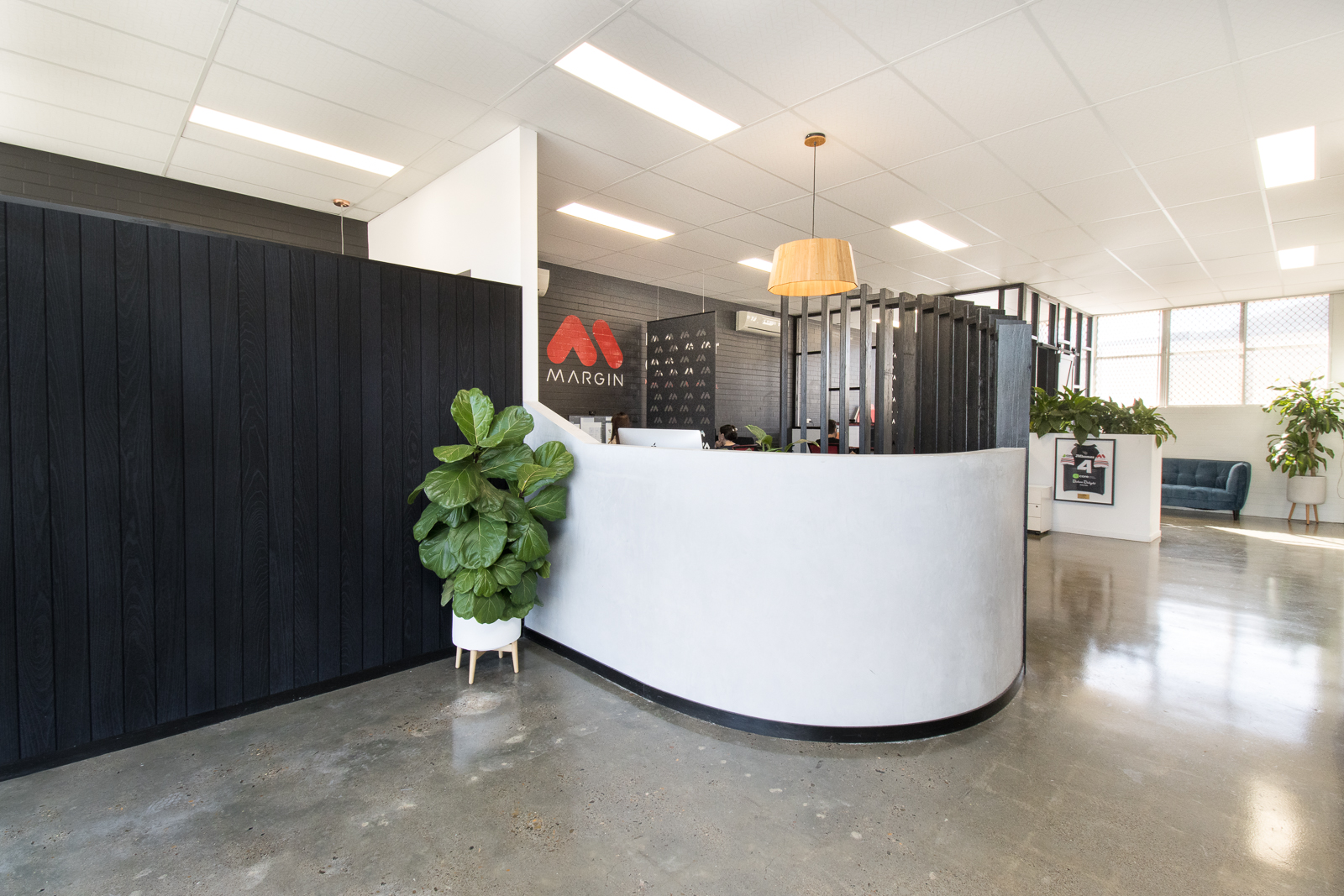
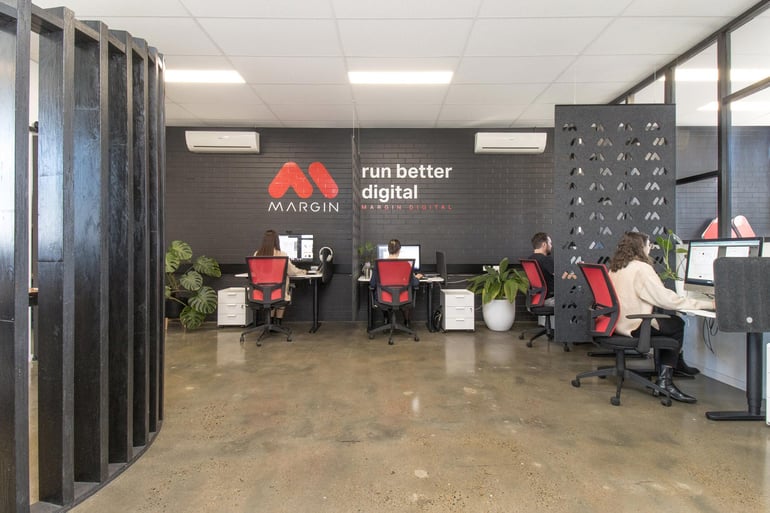
At Margin, we recently worked with the team at Acoustic Solutions Store to complete a renovation project to transform our office space into an acoustical oasis. Learn more in this blog!
The Benefits of Better Office Acoustics:
Research shows that taking the time to improve the acoustics in your office space can drastically improve the workflow of your team. Here are some of the key benefits:
- Improved productivity
- Improved concentration
- Improved mental health and well-being (less stress!)
- Improved communication
- More privacy
- A more pleasant work environment
But how much of a difference do acoustics really make? You tell us.
The Challenge:
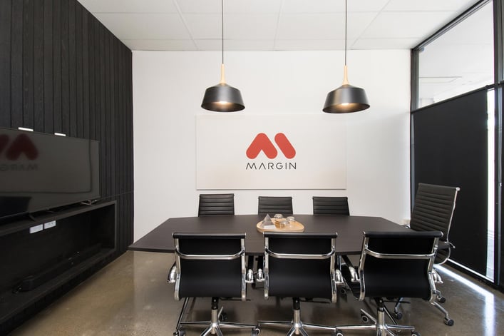
We had an open-plan office space that was echoey, noisy and disruptive. We had no privacy for meetings with clients or phone and video calls, as the noise would travel throughout the space. Our boardroom was also echoey, making it difficult to communicate with the team during meetings. What we needed was an acoustic solution.
The Solution:
The team from Acoustic Solutions Store started by completing an Acoustic Appraisal. This highlighted acoustical problem areas in our office and identified ways to improve. From this appraisal, Mike and Damon then came up with a creative solution that was functional, attractive and on brand.

The Acoustic Solutions Store team installed a range of Autex Acoustic Products in our office space. Designed to absorb excess sound, these products improve acoustics and reduce echoes, whilst looking great.
In our office in Alderley, Brisbane, they installed:
- Autex Cascade hanging screens for improved privacy, branded with our logo
- Autex Quietspace ceiling tiles throughout the space
- Autex Cube panel in the boardroom, branded with our logo
Results:
Once the installation was complete, the results were clear. The echo was gone! We had an 80% improvement in the reverberation time (RT) of our office, from 2.5 seconds to meet the standard of 0.4 seconds.
Our staff found it is easier to have conversations and communicate clearly in both video and face-to-face meetings. They also enjoy the enhanced privacy and concentration that the Cascade hanging screens provide.
Digital Marketing Specialist Delia says, “What I’ve noticed since I’ve come back to work the next day is that it’s so much quieter. It’s made such a huge difference to the working environment, especially when it comes to video calls. Previously, my voice was bouncing around the office and the microphone wasn’t picking it up clearly, but with the new acoustics, the sound quality is really clear. It’s a really great experience for the clients as well.”
Testimonial:
Hear it straight from the Managing Director at Margin Media. Watch our exclusive testimonial video as Mat Lewis shares his firsthand experiences after implementing Autex Acoustic products in our office.
Mat says, “I absolutely love it. You’ve nailed the brief. You’ve reduced all the echoing in the space. I can’t wait to get the team back in here and get to work.”
Watch the video!
Need to Unleash Productivity in your Office?
Chat to our friends at Acoustic Solutions Store!
Acoustic Solutions Store brings industry-quality acoustic solutions to consumers. Through their cohesive design consultation and acoustic appraisal process, they can provide customised solutions to suit your space, budget and timeframe.
With over 15 years of experience in the industry, Acoustic Solutions Store is your trusted partner for all your acoustic needs. Talk to them today!